Yonks AW25
Jeans Label & Care Guide
Brand Identity
Packaging Design
Copywriting
Yonks is a Kiwi-run clothing brand with the mission of inspiring people to live with purpose and make every moment count. By blending youthful playfulness with a heritage aesthetic, they wanted to develop brand touchpoints that felt authentic on the garment, not just decorative packaging.
Strategy
We reimagined one of Yonks’ existing slogans, 'Why Wait?', giving it a more heroic framing as 'Seize the Hour.' Each element was designed to communicate persistence, forward momentum, and a pioneering spirit.
Design
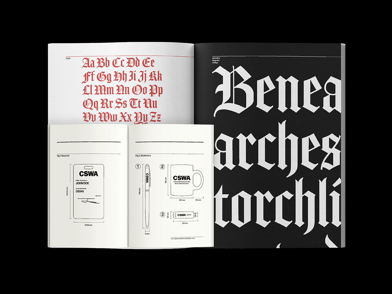
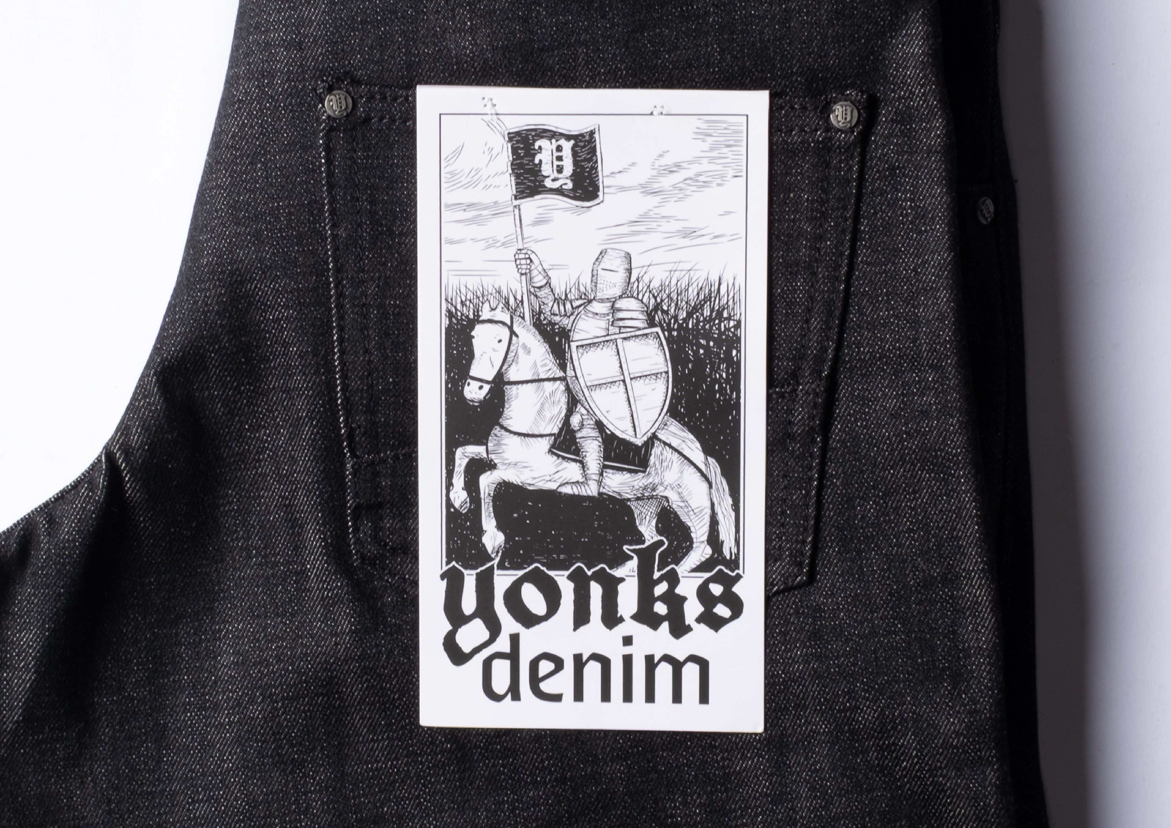
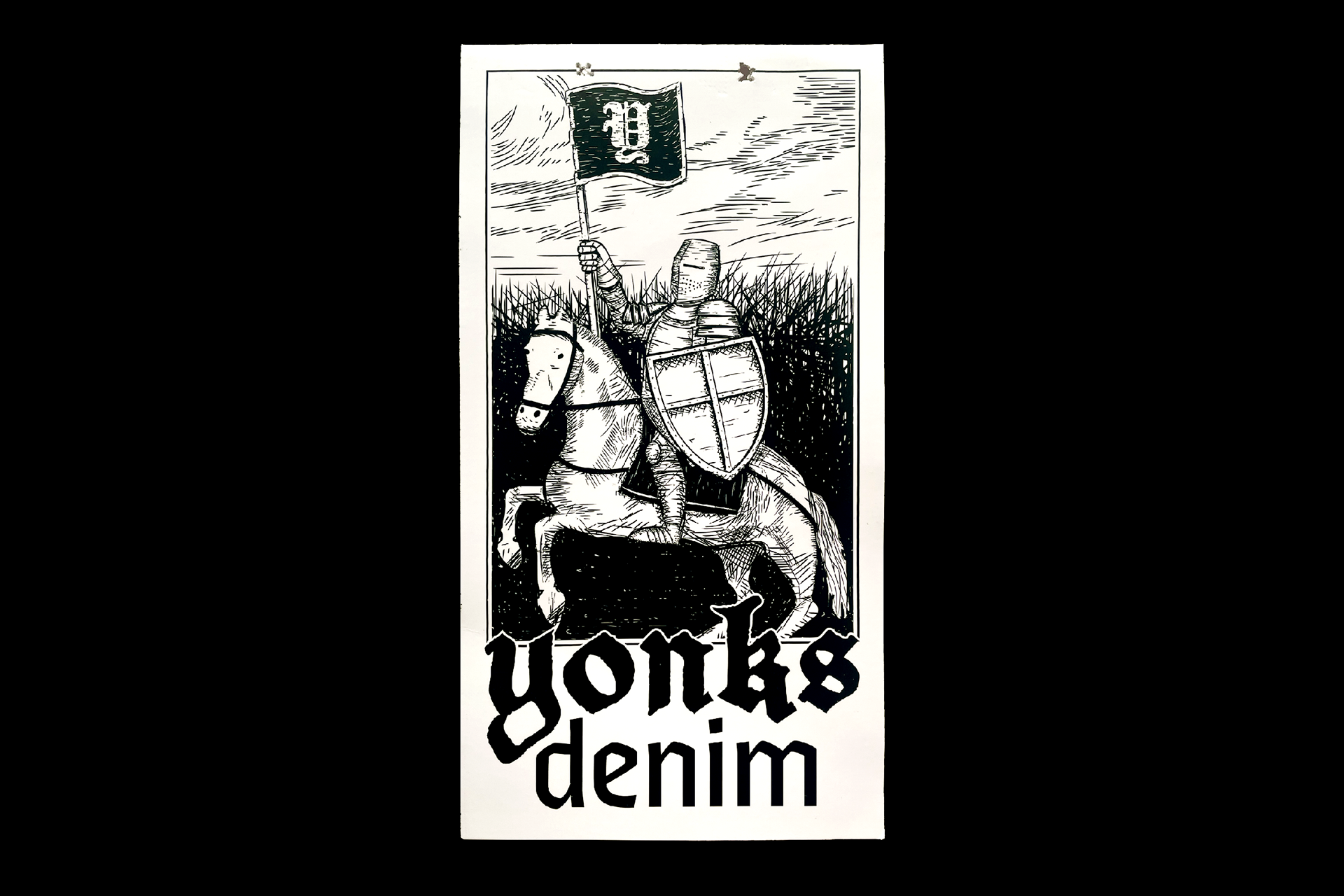
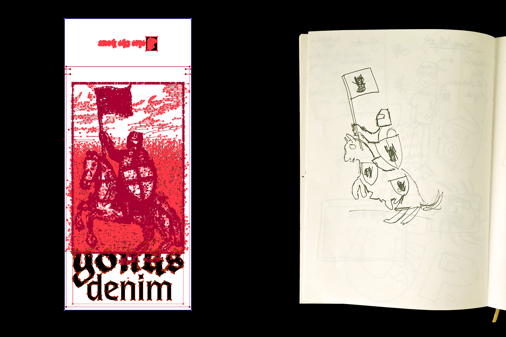
The back pocket label features a medieval-inspired illustration of a knight on horseback, being a symbol of persistence, momentum, and pioneering spirit. The flag recontextualises the Yonks logo as a heritage emblem, embedding brand identity into the narrative.
Typography reinforces this balance, pairing strong, legible type with blackletter script to modernise a traditional aesthetic.
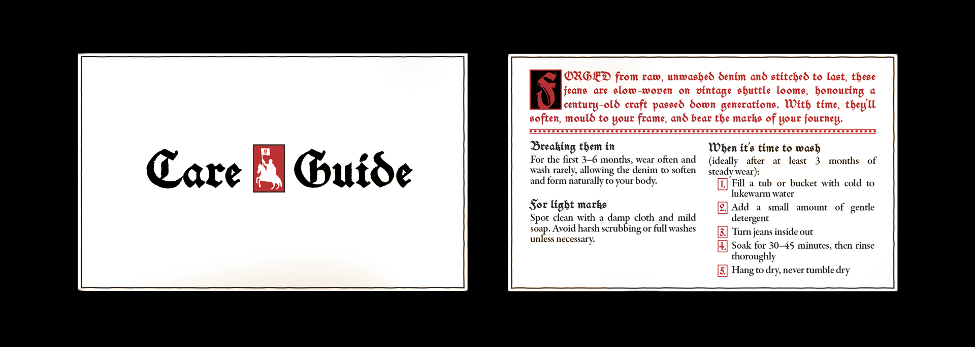
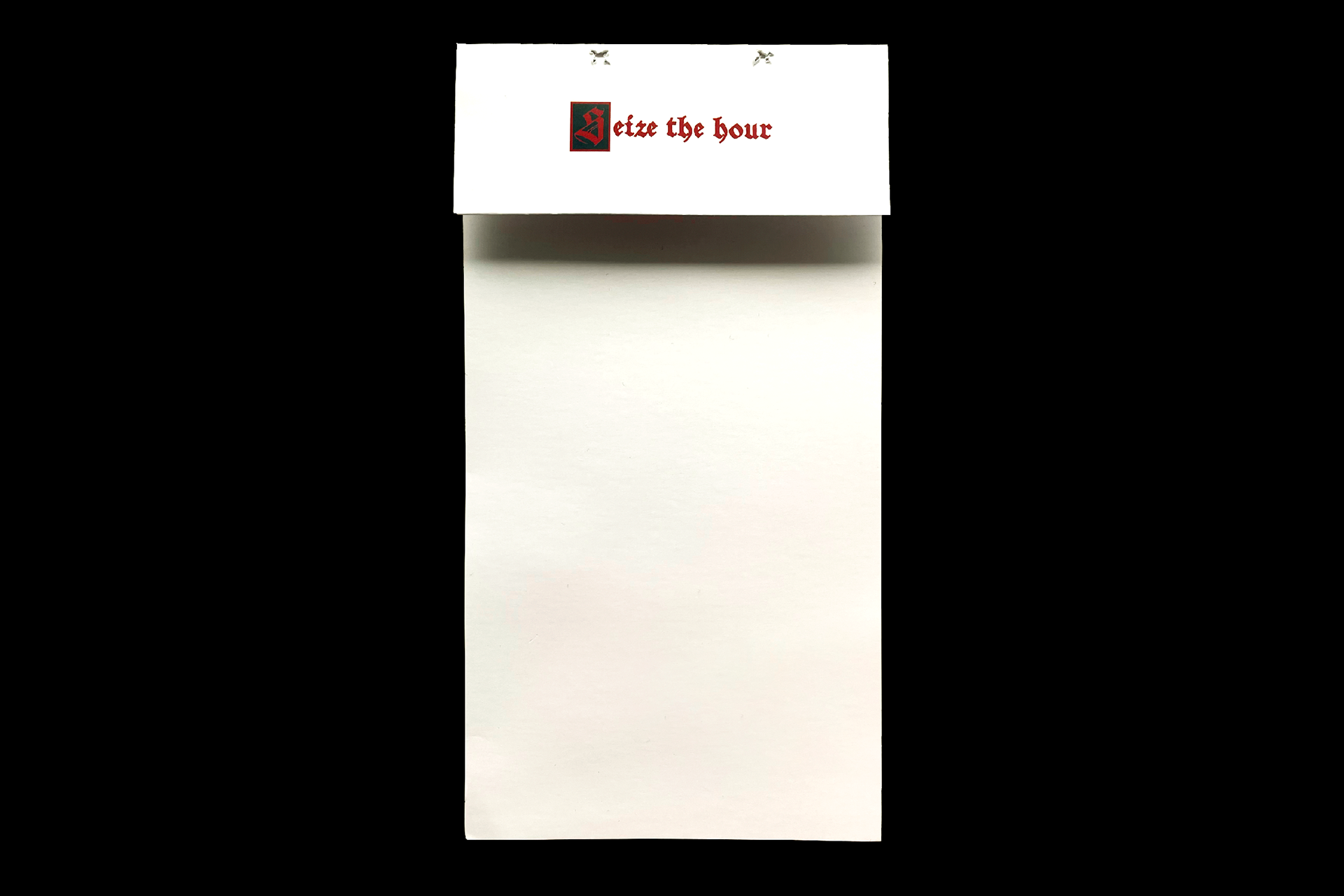
Care Card
The denim care card extends this language into a functional format. Here, the knight is abstracted into a condensed icon, estvablishing a companion piece that complements the label while keeping the two designs consistent.
Results
Together, these designs integrate storytelling into small but meaningful brand details. By combining illustration, heritage references, and practical communication, they strengthen Yonks’ identity both on and off the garment.