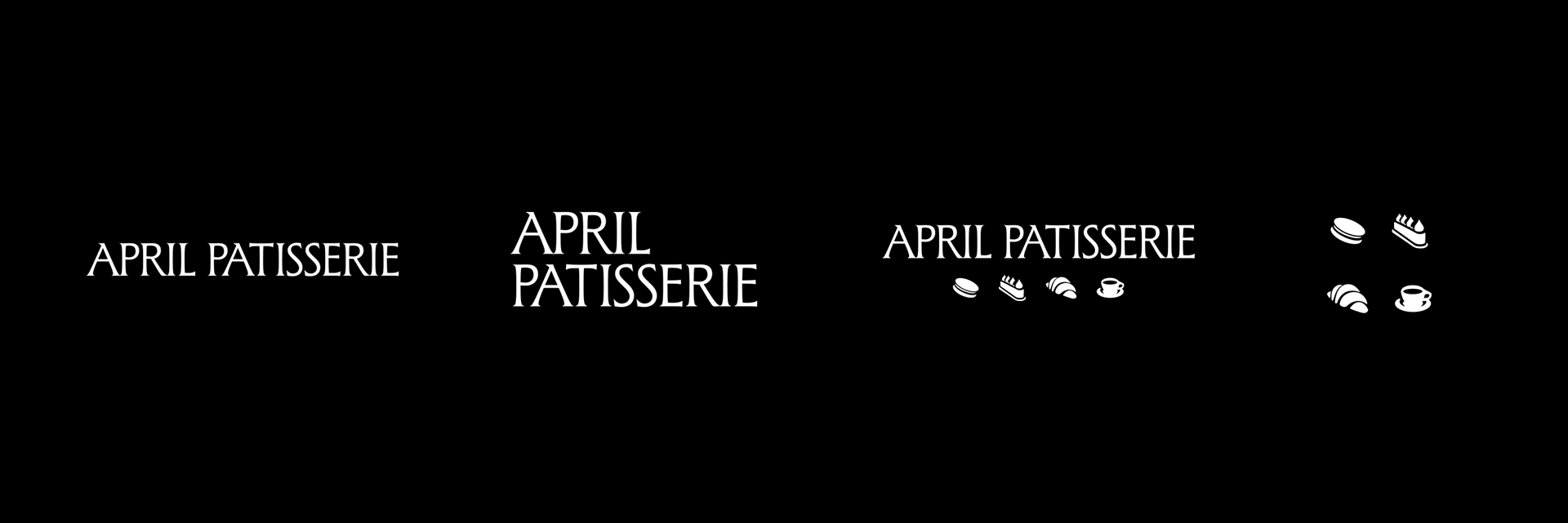
April Patisserie
Logo & Icon Family
Brand Identity
Logo Design
Typography
April Patisserie, an emerging Wellington bakery, was looking to refresh its identity ahead of opening a physical store.
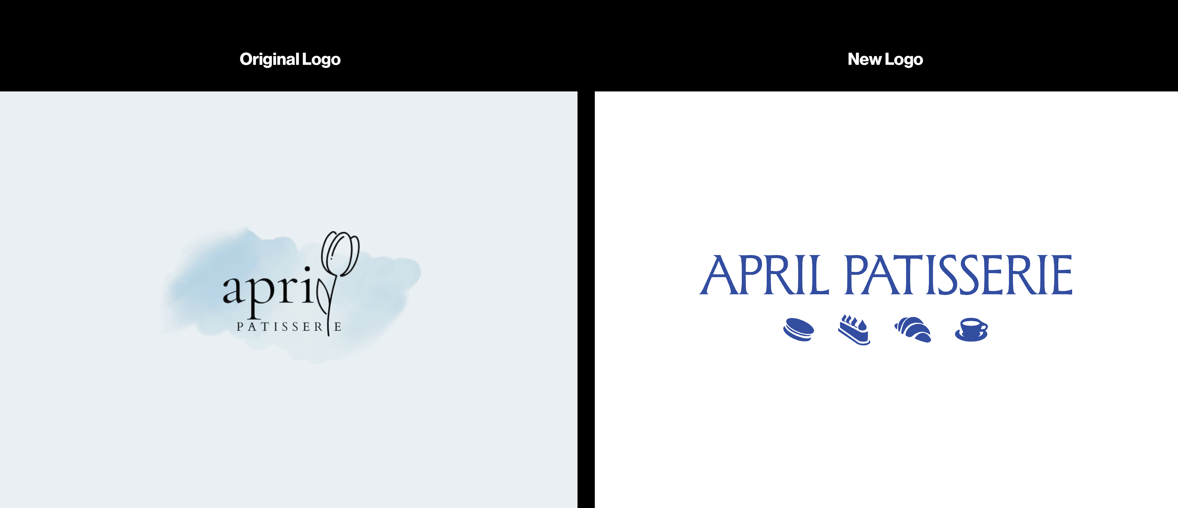
The previous logo, a watercolour background with lowercase serif text and a floral accent, didn’t clearly communicate the brand’s focus or feel.
Strategy
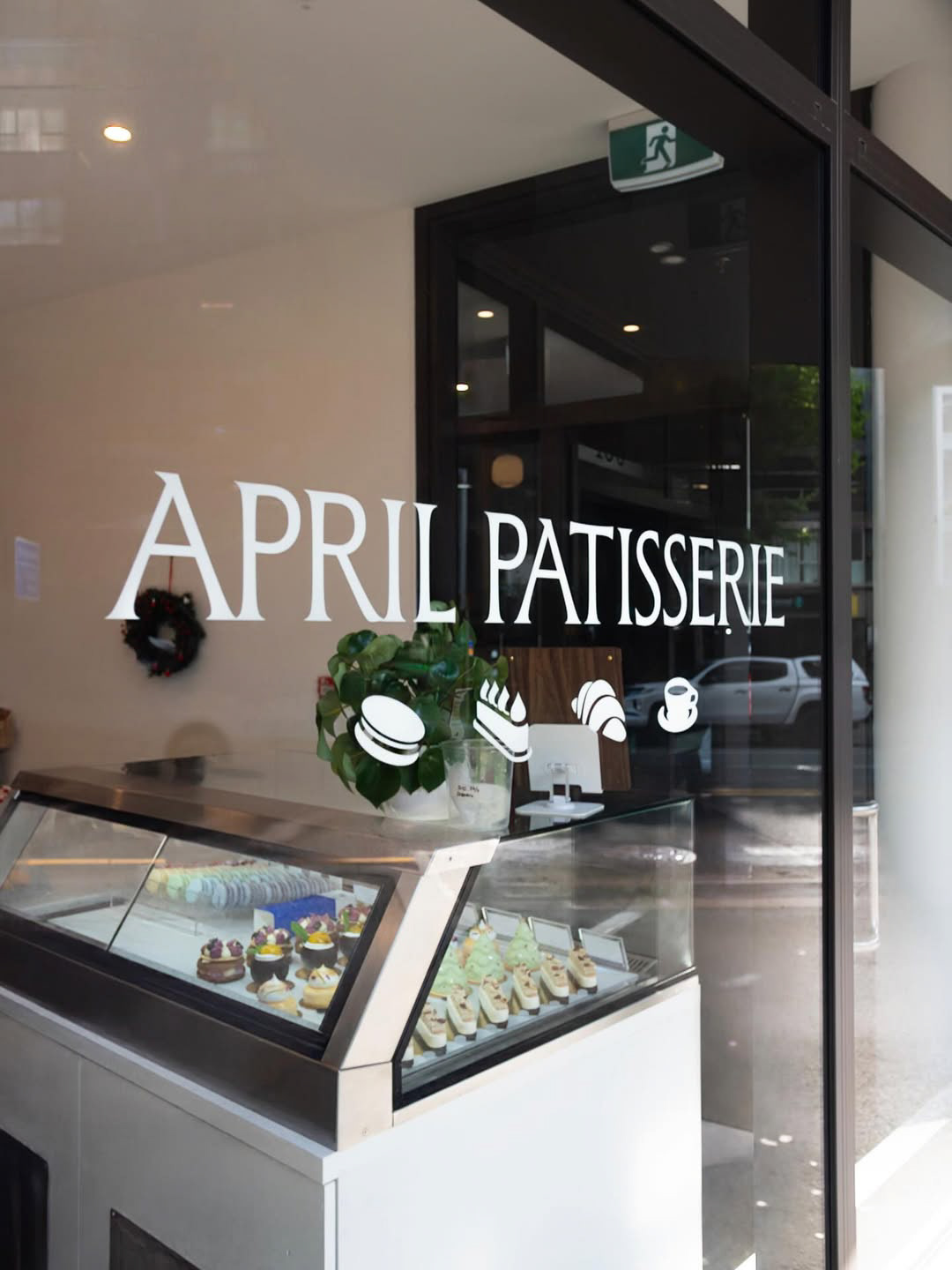
The clients were inspired by their experience of Wellington’s clear blue skies and wanted a brighter, more contemporary identity that communicated elegance without being overly ornate. They also wanted to produce a more versatile, scalable logo to be used across packaging and signage.
Design
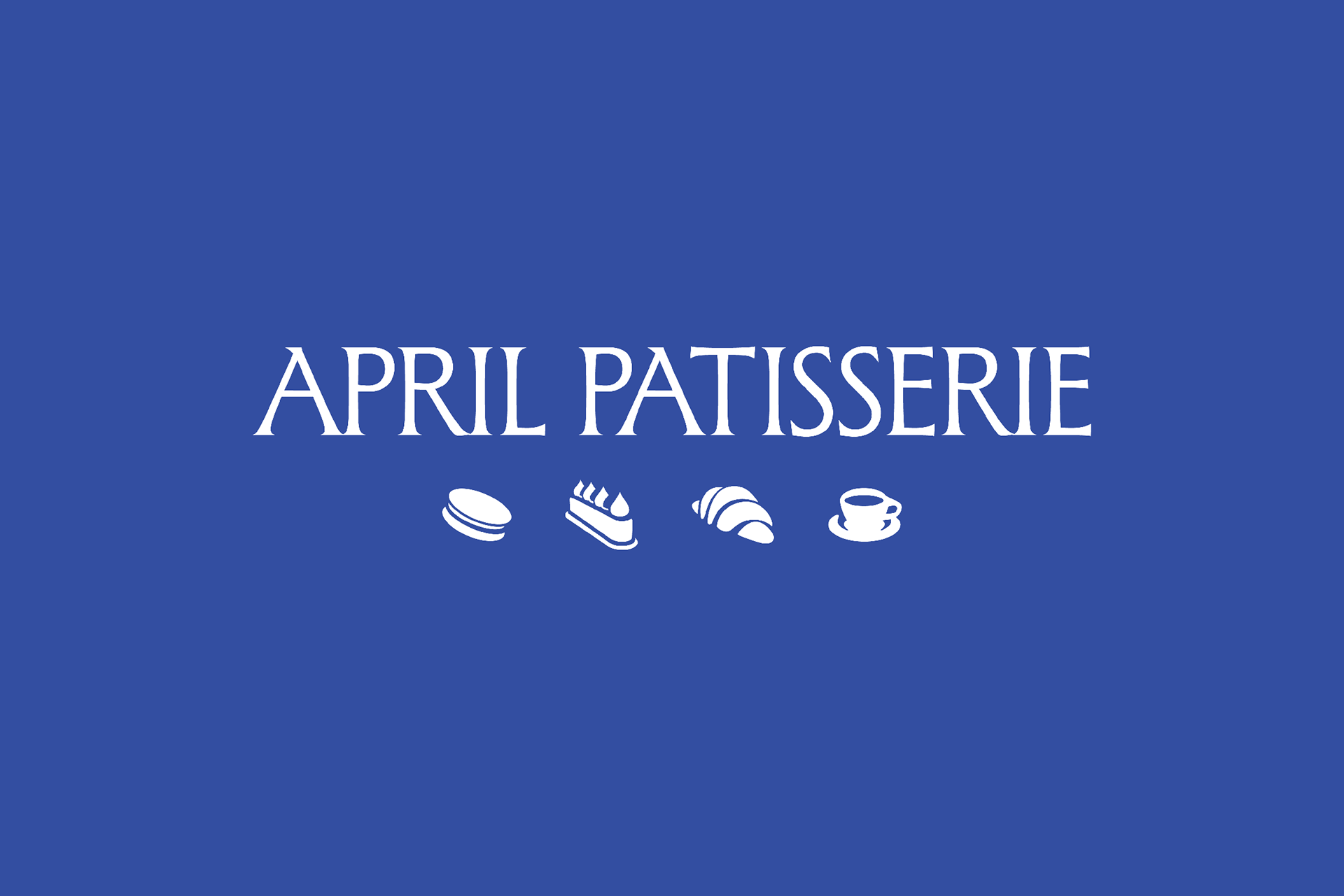
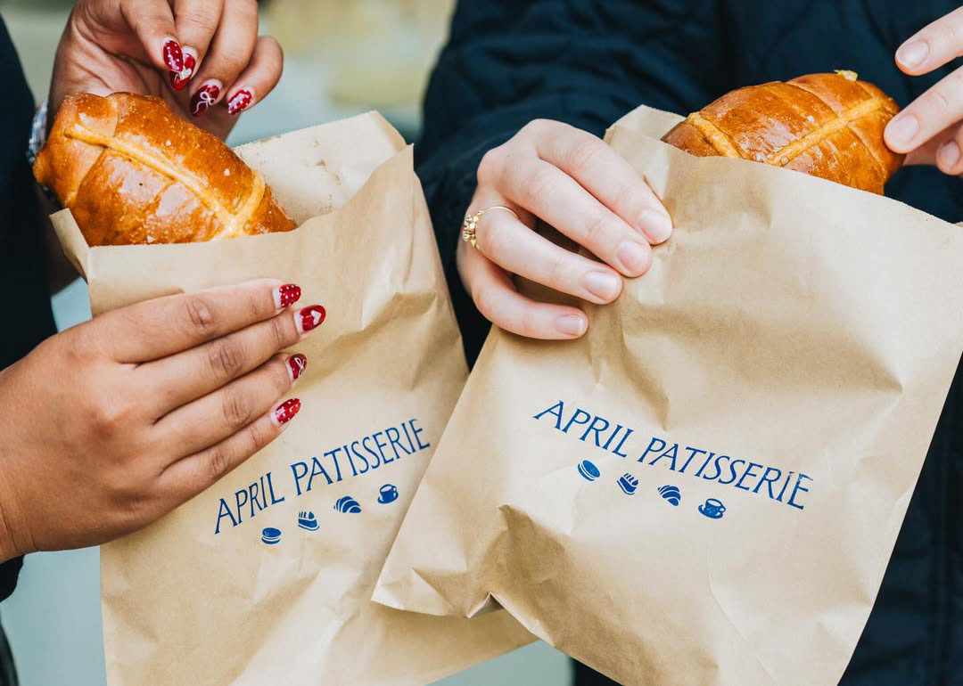
The redesign uses clean serif typography paired with a family of rounded, organic icons representing the brand’s core offerings: a macaron, signature gateaux, croissant, and coffee mug.
The icons use negative space and simple forms to feel approachable yet refined, while the typography provides structure and balance.
Results
Floral elements were explored but ultimately removed at the client’s request to keep the identity focused on offerings of the patisserie itself.
The result is a bright, contemporary, and versatile identity that clearly communicates April Patisserie’s products with a balance of elegance, formality, and tradition, with a personal, artisanal touch.

Design: Caleb White
Photography: Le Cordon Bleu New Zealand
Source: Instagram post, Le Cordon Bleu New Zealand
https://www.instagram.com/p/DSZAPeMEmcG/
Photography: Le Cordon Bleu New Zealand
Source: Instagram post, Le Cordon Bleu New Zealand
https://www.instagram.com/p/DSZAPeMEmcG/
Design: Caleb White
Photography: WellingtonNZ
Source: Instagram post, WellingtonNZ
https://www.instagram.com/p/DWM7_9FEx0P/
Photography: WellingtonNZ
Source: Instagram post, WellingtonNZ
https://www.instagram.com/p/DWM7_9FEx0P/